By Janus Boye
I was recently asked to present at an internal seminar for senior management and representatives from communication and IT in a large and complex organisation. My presentation was focused on distilling what the best are doing to create outstanding digital solutions.
During the presentation I shared examples from Boye & Co members and others. Some of the examples I highlighted are award-winning case studies, while others are inspired by organisations and key individuals I have met during the year. In other words: The term best is used here based on my subjective view.
It has already been 2 busy weeks since the presentation and I’ve had more time to reflect on the many things going on at the moment in the digital transformation space. Here’s my updated list.
1) The best are where the users are
The role of the website has changed over the past years. While it used to be the center of the digital universe for most organisations, it is now more like an important planet in the solar system. Today at many organisations, sites like Facebook or Youtube compete for the role of the sun.
Depending on who your customers are, it might make more sense to invest heavily in Facebook, than to create a fancy website.
Wired did the thing analysts and press like to do from the time to time by declaring something dead. This time it was the Web which in their view was dead back in 2010. This year, they changed their mind in a story with a less catchy title: Wait! The Web Isn’t Dead After All. Google Made Sure Of It. Their main point was that Google, with their mobile version of Chrome, has kept the Web alive.
I do agree that mobile solutions are an important part of the equation when it comes to being where the users are. This goes externally where many succesful companies rely on an app experience and have websites that are little more than a business card.
Mobile obviously also makes sense internally, where mobile solutions are paving the way to create solutions for internal users who don’t sit at a desktop all day long.
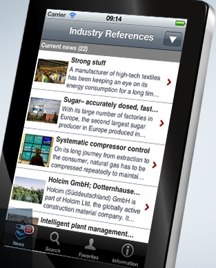
The example from the left is from German industrial giant Siemens, who have rolled out the SiemensWorld app to employees world-wide alongside many other specific apps, e.g. for events and for training.
2) The best speak the language of their customers
Do you speak my language? When meeting with a large international hotel chain earlier this year, we discussed how much money it costs to create translated versions of the booking form in each and every language and how they compete with booking sites likes hotels.com who can invest heavily in localised interfaces. It does make a real difference in terms of conversions if the content is in my language or not.
A good example of good customer service in local language and dialect is Nacka Kommun, a municipality just outside the Swedish capital of Stockholm. As shown below they offer content in several dialects and languages and are currently looking for volunteers to help them with Jiddish.
Directly translated from Swedish, the headline on this page from the municipality of Nacka reads Minority languages and offers links to content in several dialects and languages
I was on the jury for the EPiServer Awards, where Nacka Kommun won Best Nordic Website in the service and support category. Besides offering content in multiple languages, they’ve done a great job enabling citizens to find the information they are looking for.
Another point on speaking the language of their customers, is inspired by my meetings throughout the year with VICE media who are behind the famous vice.com news site. Quite an impressive and different media website geared towards the attractive 15 – 25 age group
A screenshot of the Canadian version of vice.com
A quick look at the site and you’ll find that this is not your parents media firm. Different stories, different angles and they take on serious topics (e.g. international conflicts and politics) as well as less suitable for work topics.
One of my take aways from the success of vice.com is also that while conventional wisdom says that the young target audience don’t want to read long texts, vice.com proves conventional wisdom wrong. The stories simply need to be well written and in the language of the customers.
3) The best think cloud-first
Cloud is not a new thing. Many organisations are already using cloud services for big parts of their digital infrastructure. Salesforce.com has been around in the CRM space for over 15 years and I can think of very few who have their own on-premise email newsletter tool or analytics tool.
When Scott Brinker presented the Marketing Technology Landscape Supergraphic 2016 at a Boye CMS Expert Group meeting in Boston in September it was clear that almost all software categories on the map are now cloud based.
From a customer point of view, I noticed a shift this summer where many of the Boye members suddenly made cloud a requirement when procuring a new digital platform. To customers it makes a great deal of sense to remove deployments, upgrades and server maintenance from the equation.
Besides Salesforce.com, big vendors like Amazon and Microsoft are now offering cloud infrastructure used by companies around the world. Cloud-based packages like Office 365 from Microsoft and Google Apps also plays a role here as it has made cloud services accepted inside the enterprise, even in countries like Germany and Switzerland with data protection regulation.
At recent Boye peer group meetings in Europe, we’ve seen how vendors like Cloud CMS, Contentful, Crownpeak and Umbraco have come a long way to offer cloud services for content management, while other vendors still have a long way to go.
Thinking cloud-first means that as a customer you first explore, whether a cloud-based service can meet your requirements. Only if that is not the case, then you consider on-premise solutions.
4) The best have an agile mindset
It’s been several years since agile left the world of programmers and became a methodology with a broader appeal. There’s an agile marketing manifesto from 2012 and a popular article from the Content Marketing Institute in June 2016 laid out how marketers can work smarter with agile methods. The Lean Startup movement also continues to play a big role shortening product development cycles.
The usage of agile is very mixed across the board and somehow it seems like agile has received a bad reputation in many organisations, regardless of how much they follow agile best practices.
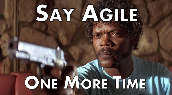
In some organisations you are best adviced not to use the term agile as it carries too much baggage
When I look at those organisations who really manage to get things done when it comes to digital and look across sectors, countries and size, they all have an agile mindset in common. Agile is far superior to the waterfall methodology as it both enables scaling and catering to changing requirements.
For more on this topic, I’ve published How to become an agile business.
5) The best uses video
There might have already been several “Year of the Video” markings in the past 10 years, but it remains an area where many organisations are still only getting started. The equipment and production costs have gone way down, but as with any content, creating good video material takes time and hard work.
Patrick Lithander who is Director Business Development at German-based content marketing agency fischerAppelt brought this amazing Youtube video on snowboarding with the NYPD to a Boye group meeting in Nuremberg:
With 15 million views and a relatively brief production time, it is one of many examples of what you can do with video that you cannot do with text-only. On the impact you can have when you leave the old-fashioned world of boring corporate videos. One of Patrick’s main points was that the time is now to invest in video and also brought use cases on how to videos and microlearning.
In Denmark organisations like Carlsberg and Jyske Bank have both invested in video for internal and external communication for several years, and led the way in demonstrating the impact of video.
6) The best work strategically with experience design
I’m a big believer in the importance of design,so I laughed when digital expert Matthias Henrici from Safari Consulting in a group meeting at Munich Airport made the convincing case for not relaunching the notorious and cult-like Lingscars site. Do visit the site if you haven’t already. This site is like an example of all the anti-web-usability best practices being used at the same time. Yet, most in the room were unwilling to bet their annual salary on a redesign having a positive impact on sales.
On a serious note, Matthias had many good points on how a relaunch and redesign can go horribly wrong. He convincingly made the case for step-by-step improvements, testing along the way and importantly using data to inform design decisions.
Lou Rosenfeld who is famous as co-author of the Polar Bear Book on information architecture made a similar point back in 2009 in a keynote at the Boye Philadelphia conference title Marrying Web Analytics and User Experience. The presentation slides has since received over 60,000 views.
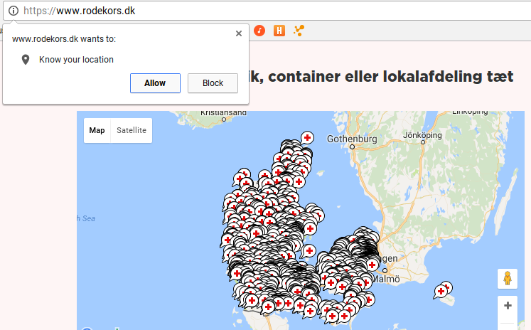
Personalisation is also a topic that has been discussed for many years, but only now beginning to see strong case studies. For those concerned with the new EU Privacy Directory, the Danish Red Cross offers a good example of personalisation without logging in by looking up my location:
Notice how the website wants to know my location to show me where I can find a Red Cross shop near my location
Thanks to Mikkel Højbjerg at City of Aarhus for sharing this practical example of experience design.
Design has so many aspects and the to do list is long to get it right. Without going too much in detail, I’ll just add two facets that deserve more attention among most:
Performance: A slow site has a very negative impact on my experience
Search engine optimisation: How you look on Google cannot be underestimated
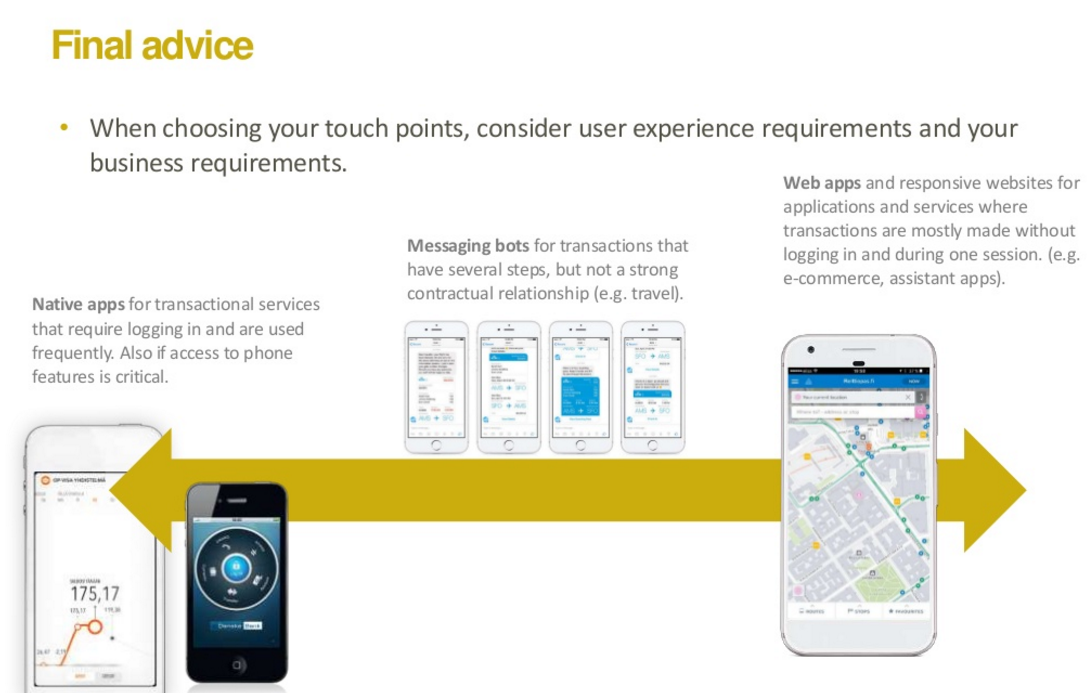
Finally, this is where the cover photo to this posting comes in. On the photo from the Boye Aarhus 16 conference is Perttu Tolvanen, a digital leader from Finland, who makes an important point on touch points and requirements. His full slide deck on deciding your digital touch points can be accessed by clicking on the slide below:
7) The best have a good navigational concept
During the past 15 years, menus and navigation have been a plague to many projects. Information architects have come and gone to try to address this, but the problem remains that navigation is fundamentally broken on too many websites and intranets. Search is also an important part of navigation, but I won’t go deeper into that in this post.
Swiss-based Roche is one of the Boye members, that I tend to highlight as someone who has a good navigational concept. See roche.com and have a look for yourself. If you visit on a mobile device, you will probably find it somewhat familiar to many other mobile-friendly corporate websites, but the real difference is visible if you visit from a desktop as shown on the screenshot below.
I tend to also highlight how they use the navigation to guide you towards the content you might be looking for. Notice how it says Highlights in their navigation. Notice also that the navigation overlays the entire website. You either navigate or use the website. Somewhat similar to Netflix. You either navigate or you watch a film.
A final anecdote on navigation and the Roche example. A day after I saw their great work at Roche, I shared it on the Boye group on LinkedIn as a best practice example. In less than 3 hours, my post received several comments from other members, more or less saying that Roche did many things wrong. I guess this goes to prove that the topic of navigation can be an emotional one and that the experts are not in agreement.
8) The best uses standard tools and develops innovative solutions
When I worked at a software vendor back in 1999 – 2002, the build vs buy discussion was not unusual. Should I buy this piece of software to power my website or should I rather build something myself? Many used homegrown solutions for all kinds of things, incl. newsletter solutions, analytics and content management.
Today, the best deploy standard solutions whenever possible and then write custom code to create innovative solutions.
To deploy standard solutions, I notice that some of the best organisations are working closely with smart agencies while others are relying on their own in-house developers. That’s fine, but when I look at those who are creating innovative, game-changing solutions, I see a clear pattern that the best have their own developers. That doesn’t mean that they don’t work with vendors and agencies, but the best have in-house skills and talent to move them ahead.
9) The best are shaping the workplace of the future
I was very impressed during my visits to the new headquarters of Tesa and Philips both in Hamburg, Germany. Both were kind to host Boye group meetings earlier this year and while Tesa has their global headquarter in Hamburg, for Philips it is their regional headquarter for Germany, Austria and Switzerland. Both organisations are large, complex and global old-economy firms, and both had put considerable thinking into changing how a workplace looks like in 2016 and beyond.
At Tesa we saw impressive display screens that offered employees the opportunity for interaction via touch. Display screens have such tremendous potential beyond showing the menu in the canteen and Tesa had taken it quite far, including for guiding employees around campus, showing relevant news and corporate history.
When at Philips, we were lucky to get a guided tour around their offices. I’ve seen similar setups at start-ups, but not at large, old-economy firms. Here’s a photo from inside Philips:
And this unusually charming corporate meeting space was available when we passed it
Some final words on workplace of the future. As Hanns Köhler-Krüner, Managing Vice President at Gartner, said in another Boye group meeting in Cologne:
“It’s not about culture change, but habit change”
He made several very good points on how to measure the success of the workplace of the future and made it quite clear that the digital workplace (or intranet if you prefer that term) was a part of it, but as the examples from Philips and Tesa show, there are much more to it.
10) The best keep learning
It might go without saying for you having read so far, but with the rapid speed of change, we need to have a hunger for learning, both as individuals and as organisations.
How do we set aside the time on a regular basis to look beyond the day-to-day meetings and over-crowded email inbox?
There are several good approaches to this. I’ve learned tremendously from travelling, from visiting other firms and talking to peers. I would like to read more books and watch some more TED talks. Others will have different approaches that work well for them.
Learning can be institutionalised and learning can and also be fun. When it comes to digital, learning can also be tough, painful and stressful. There are many learnings from having problems with a website that is down, from having prematurely published the confidential press release and these things to happen.
To quote American blues singer BB King (1925- 2015):
“The beautiful thing about learning is nobody can take it away from you”
What did I miss? Anything you disagree with? Please do feel free to leave a comment below
