By Janus Boye
How do online businesses exploit consumers through carefully designed tricks and traps? Regulations are changing rapidly, and we're seeing a big rise in legal enforcement. But is it enough to protect consumers?
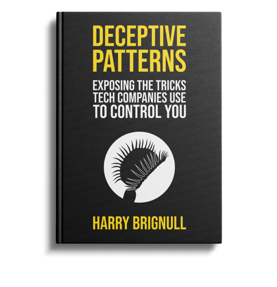
Our former Boye Aarhus conference keynote speaker Harry Brignull published his first book back in August 2023 titled: “Deceptive patterns - exposing the tricks tech companies use to control you”
Based on work on deceptive design (also known as dark patterns) that started back in 2010, the book takes you into the shadowy world of deceptive design.
Harry holds a PhD in cognitive science and works as Head of Innovation at UK-based pensions firm Smart. We recently did a member’s call with Harry as an informal book launch to our community.
Below you can find my notes from the conversation, a bit added background from a decade of following his work, a few of the slides and finally the entire recording.
Let me start with some background before launching into the book.
Designing for the short term
Much has been said and written about branding. Many organisations consider their brand to be their most valuable (yet intangible) asset. Today, it is not just a subject for those that work directly with marketing. Branding has a tendency of spanning much wider and is now also something that is being considered carefully by all involved in digital projects.
Specific authorised colours and a well-known logo are the basic elements that make a brand recognisable and help support the identity and trust behind the brand.
As a designer you work with these to create a visual identity and a digital concept that ideally supports and strengthens the brand.
However, since around the early 2000’s some digital professionals have taken their involvement a step further by deploying manipulative design techniques for short term win, but ultimately eroding trust and any brand goodwill.
The term dark patterns was launched back in 2010, when Harry registered the darkpatterns.org website. Harry remarked at the time that the goal of the campaign was to draw attention to the increasing use of techniques from cognitive and social psychology to manipulate users into completing a goal intended by the designers of digital products. Today the darkpatterns.org website redirects to the newer site deceptive.design.
What are deceptive patterns?
So, what are we specifically talking about? Deceptive patterns are tricks used in websites and apps that make you do things that you didn't mean to, like buying or signing up for something. For example:
There’s actually 16 (!) different types of deceptive patterns. Sadly more patterns have been added recently as the list “only” had 12 types in 2019. May the practice actually be getting worse?
To make us think, Harry raised these two questions before he showed us a few examples:
What if we're not trying to be helpful?
What if we want to discourage users from doing something that costs our business money?
Did that get you thinking? Let’s look at some examples.
Examples of deceptive design
Harry shared the “Create an Intuit Account” screenshot (below). You'll notice that the legal terms are far smaller and lower contrast than other text on the page, which means that some users might not notice the legal terms at all.
As Harry pointed out, the text below the button is harder to read and if you attempt to fill out the form on a mobile device, the small text will often be invisible below the fold. Does this mean that the user can actually give consent? Harry was an expert witness in a lawsuit (Arena vs. Intuit Inc.) on this specific issue against Intuit, where it came out that 0.55% of users who registered or logged in during a four-month period in 2019 clicked the terms link.
The United States District Judge concluded:
“The Court finds that a reasonable consumer would be less likely to notice text in a significantly fainter font than other text on the same page.”
A key point for the Intuit case is that when taken to the Ninth Circuit, the decision was actually reversed, which demonstrates some ambiguity in the nature of the case and US law.
There’s actually a collection of examples from Intuit and their deceptive design practices, if you go to the Intuit page in the Hall of Shame on Deceptive Patterns.
We then moved onto Figma and their practice of exploiting expectations. Specifically they used a deceptive pattern called Sneaking, which Harry describes as drawing a user into a transaction on false pretences, because pertinent information is hidden or delayed from being presented to them. The example we saw was when the “Share” button in Figma triggered additional costs if you selected the “Can edit” option. This is not the case in Google Docs and similar tools, so you could argue that the user did not expect additional costs to incur. With many Figma users being on corporate credit cards, this resulted in additional costs that often went unnoticed and buried in a larger Figma invoice.
Finally, Harry shared the so-called Money Bomb, which Trump used for the 2020 US Presidential campaign, where they very effectively guided online donors into weekly donations. Demands for refunds spiked. Complaints to banks and credit card companies soared. But the money helped keep Donald Trump’s struggling campaign afloat. New York Times documented it all in this 2021 article: How Trump Steered Supporters Into Unwitting Donations.
The situation today and the road ahead
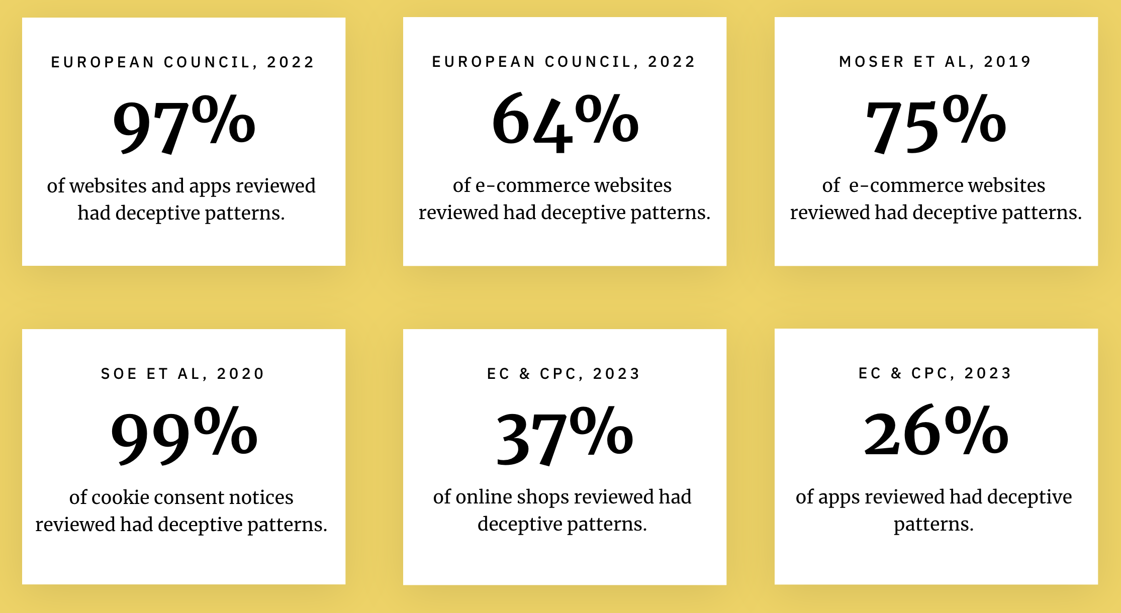
Harry showed the below slide to illustrate how widespread the usage of deceptive patterns is:
Deceptive patterns cause harm to individuals (e.g. financial loss, time loss), groups (e.g. people with disabilities, second language learners and people who are in a hurry) and also to the marketplace (e.g. by making it hard to cancel services, creating lock-in to existing services and hindering shopping around).
To quote Harry:
“Deceptive patterns are a rational response to an under-regulated and under-enforced marketplace.”
In recent years the European Union has put in place extensive new laws to combat these bad practices, including:
UCPD: forbids a number of Deceptive Patterns and bans many others using principle-based rules regarding unfair, misleading and aggressive practices.
GDPR: forbids certain Deceptive Patterns that fall within the realm of data and privacy.
CRD: bans pre-ticked boxes for additional payments and a few other types of Deceptive Patterns
DSA & DMA: huge new laws coming soon that target big tech companies and explicitly regulate Deceptive Patterns in a few different ways.
In the US, the FTC & CFPB has been asked by Biden to stamp out "junk fees". There’s also a growing collection of big cases which has been won, including:
FTC vs Epic Games - paid $245 million to settle
FTC vs Publisher Clearing House - paid $18.5 million to settle (Harry was the expert witness)
FTC vs Vonage - paid $100 million to settle
For more, Harry maintains a rapidly growing list of deceptive design legal cases.
Learn more about deceptive design and dark patterns
The book also has its own website - deceptive.design - where you can explore further, and naturally also buy the book.
It was back in 2013 that Harry came to Aarhus and talked about dark patterns. We teased Harry’s keynote like this: “Join the bright side if you are a dark patterns bandit designing for the short term” and Karolina Luoto from Finland summed up his excellent keynote like this:
Be careful that the service does not work against your values. If your organization strives to be fair and customer-oriented and to generate goodwill, the newsletter subscription box may not be selected by default. With usability research, weed out the scheming paths that manipulate or lead astray.
Finally, the conversation about deceptive design naturally continues in our peer groups and at our conferences.


